Though we haven’t surfaced online in a while, the Design Team has been hard at work. We have been perfecting logos and considering other sites to figure out what we wanted our design elements to resemble. Here’s where we are so far.
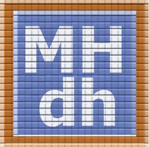
We designed our logo to evoke a subway stop mosaic, using images found in Helvetica and the New York City subway system (MIT Press, 2011) as inspiration. The logo comes in two sizes: one long and rectangular, with the full title, which will be on the header of the main page, and the other square, with only the acronym, for all child pages. The color choices will be adapted when we finalize the palette of the site, but the general effect is this:

We also identified the Morningside Heights map image that we want to use as the centerpiece of the main page: this comes from the 1891 Atlas of the city of New York, Manhattan Island (Phila.: Bromley):
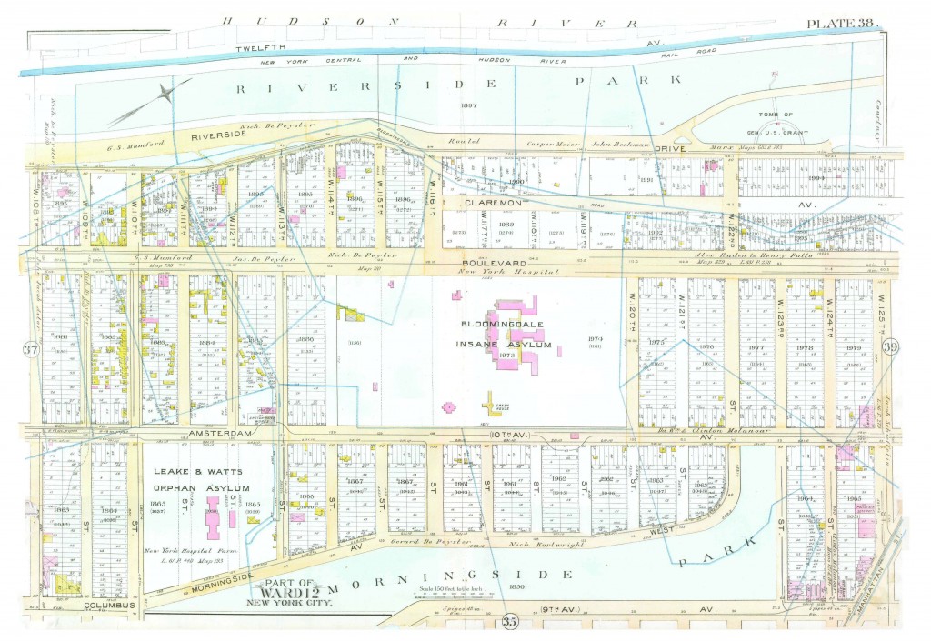
This is not the full size, of course, but it gives the effect and, because it reaches from 105th to 125th Streets, and from Morningside Park to Riverside Park, it offers all the locations that our staff is working on.
When it came to thinking about the site itself, we looked at Omeka themes, and were drawn to the charcoal, yellow, and red of “Dark”:
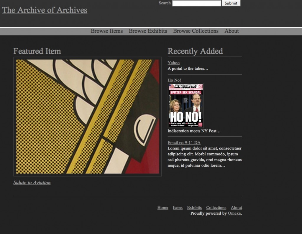
…but we were told that this particular theme doesn’t offer the functionality we’re going to require. We’re going back to the drawing board for the theme, but we’ve been assured that whichever theme we choose, we’‘ll be able to modify it with this color scheme.
When we began to think about how we wanted the page to look, we found some inspiration in other sites. The Jan Brueghel Wiki inspired us to choose the “Dark” Omeka theme, as it had that grey, yellow, and red color scheme we liked. That palette will also inform the colors of the logo, as mentioned above.
The <a href=”http://medici.org/”“>Medici Archive Project</a> has a particularly lovely page. We liked the placement of the logo, and the serif font. We also liked the large tabs for the header menu: and decided that our tabs would likely be:
About
Morningside History
Images
Bibliography
Contact Us
Columbia’s own Mapping Gothic France page had the subtle, minimalist footer we preferred. We were also intrigued by the thematic divisions of “Space,” “Time,” and “Narrative,” and will be thinking more about that when we think about how we are going to create navigation paths.
Finally, we were interested in the Digital Harlem: Everyday Life 1915-1930 site, from the University of Sydney, for obvious reasons. It, too, has a map as its focal point, although as a database, it has a much more complex search interface than we are likely to have. But it does give us a visual cue for how our page will eventually look.
We have noticed that the cleanest pages, visually, follow a 2/3 to 1/3 rule, with a sidebar taking up the 1/3. Our sidebar will most likely offer a rolling list of news, blog post links, and tweets.
And that’s where we are in mid-August 2014. We have just a bit more refining to do, and then it’s over to the Development Team!