The Design Team learned about a new concept this month: wireframes. These are detailed layouts of what a webpage (home page and interior pages) will look like. To our dismay, the scribbled pen-and-ink rendition we’d generated just wasn’t enough:
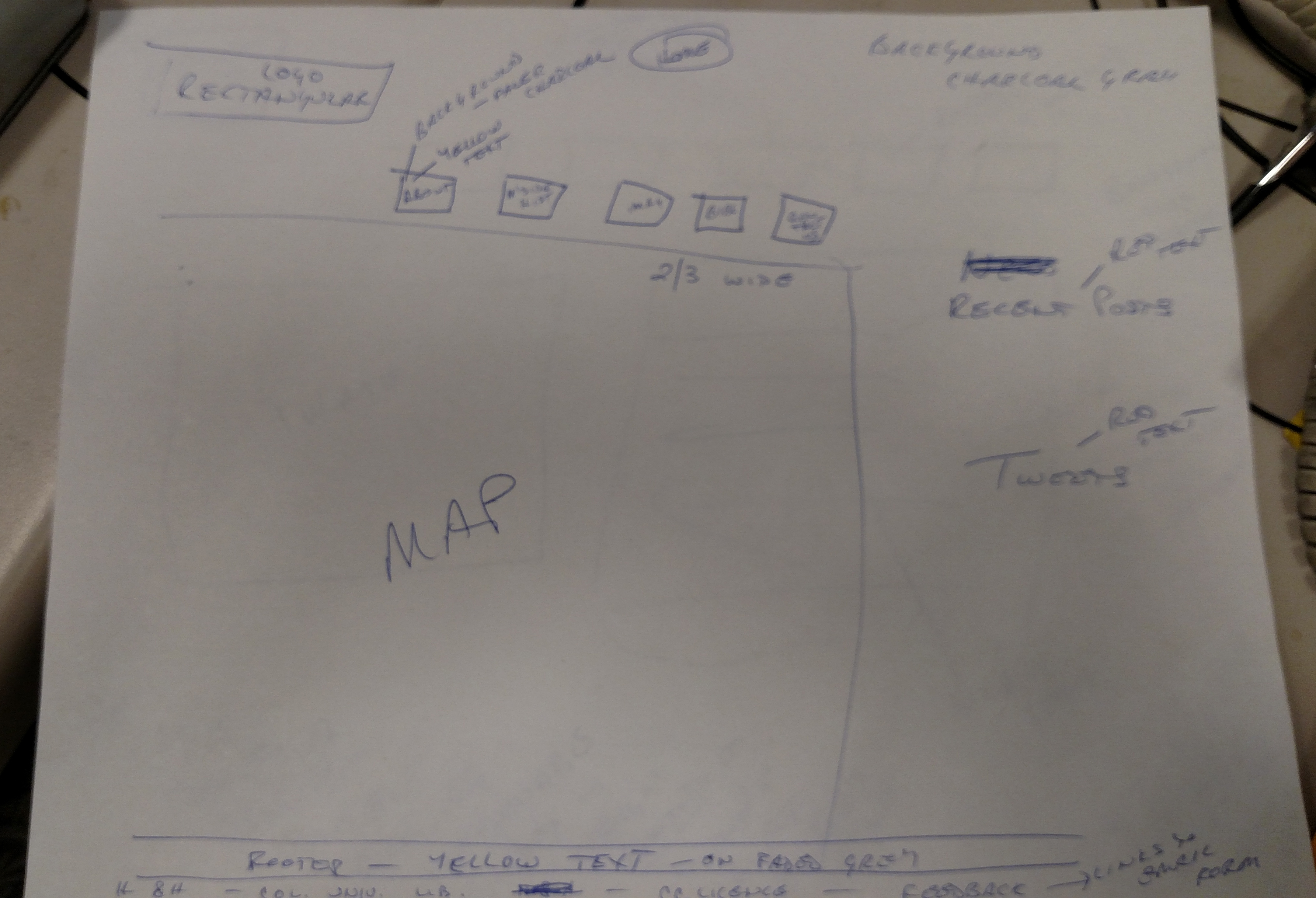
Gosh, wasn’t that clear? Apparently not. We met with Alex, from the Development Team, to create a PowerPoint slide that would give a better sense of what we envisioned. The Development Team had taken our map image:
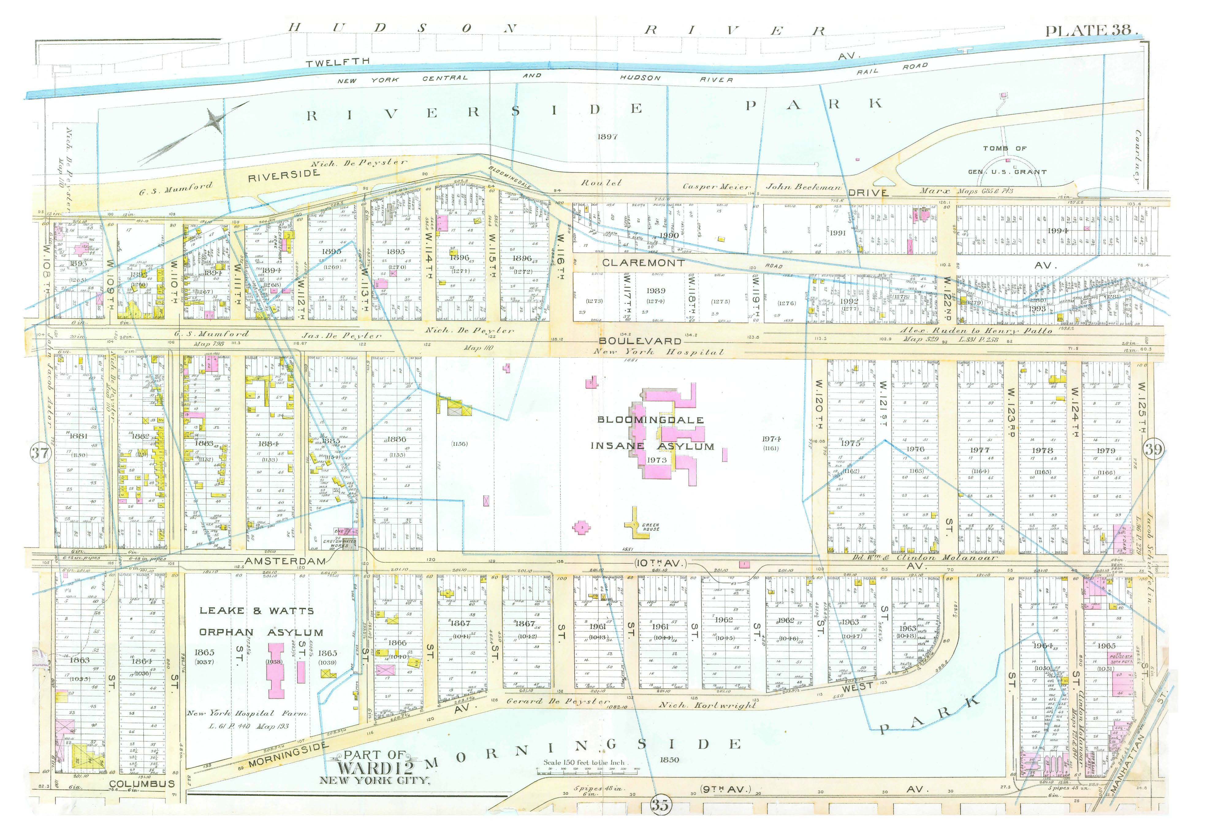
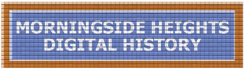
and made it golden, to match the border in our original logo:
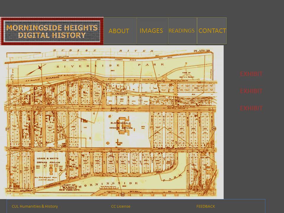
Those colors had just been placeholders, however, as when we designed the logo we hadn’t settled conclusively on our color scheme. The Design Team was still enamored of yellow and red on charcoal grey, as seen on the Jan Brueghel wiki site. We had applied this to our logo design, and envisioned it as yellow text on a charcoal grey background, with a dark crimson border. On Monday December 15, we met with Alex to learn how to change the color.
Alex matched the yellow of the map for our text, but we had a difficult time identifying a red that pleased us. The complementary colors suggested by color wheel sites online were not attractive. The Design Team made an executive decision to thrown color-wheel logic to the winds and just choose a red we liked. We didn’t find one that made us 100% happy–most were more cherry than crimson–but we found one that would do for the sake of the wireframe.
We made box shapes and text boxes that could move independently of each other, learned how to make colors transparent, and played with the 2/3-1/3 split. At a meeting of the entire division this morning, we honed things a little more (abandoning a fifth tab to be called ‘Morningside History,’ after realizing it was redundant; and deciding to place the links to exhibits in the righthand 1/3 of the page instead, after learning that the feeds we’d hoped to place there wouldn’t work with our platform). In the end, it looked a little like this:
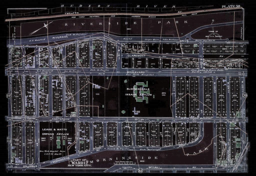
The Design Team was asked if we were wedded to this color scheme; if the scheme was significant in some way for Morningside Heights. It wasn’t: we just liked it. But there was a general feeling that that original map had more interesting colors:
and we began to wonder if it might be better to return to it, and perhaps borrow colors from it for the logo.
Another option was to use the original map in negative, which fits with the charcoal background of the site, and would make the red and yellow text accents pop even more:
The entire exercise was a terrific lesson for the Design Team in managing expectations. While the general wireframe for the homepage (we didn’t even get to the exhibit page yet!) was warmly received, we learned about what our platform could and couldn’t do, and what the entire team was happiest with.
More to come!